 Q3
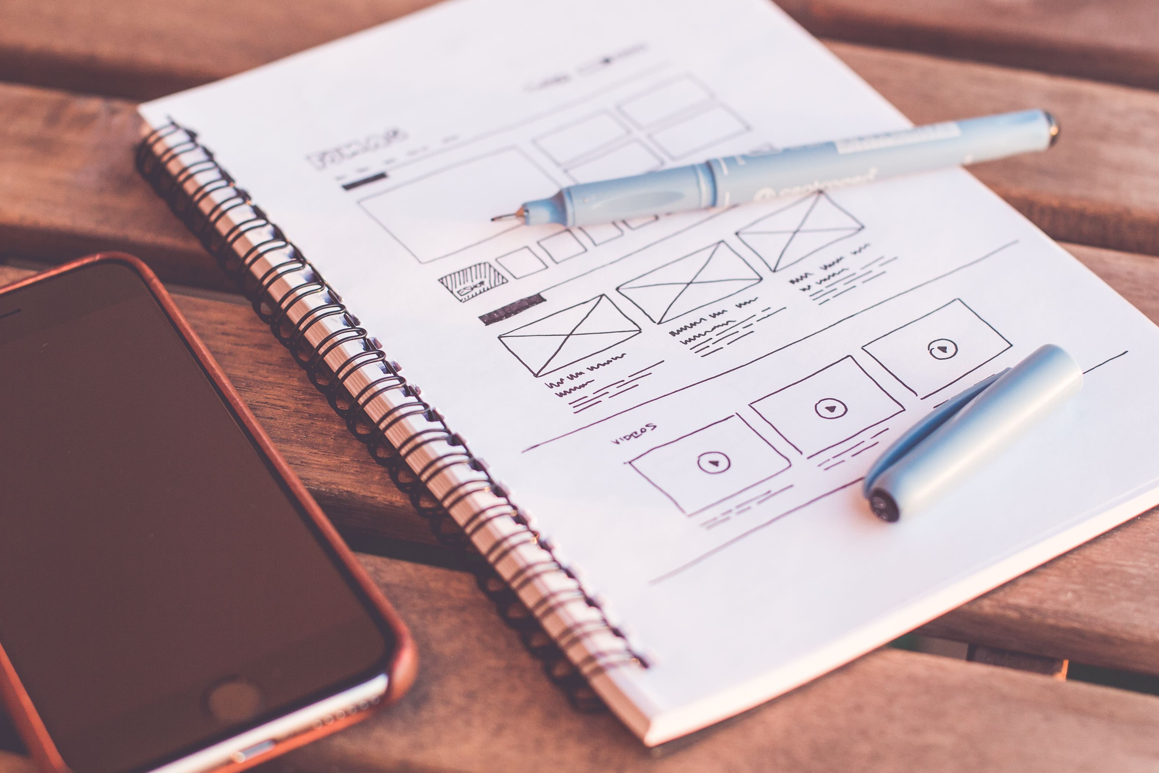
Landing page optimization comes down to about eight elements, worth fixing in a specific order: a headline matching the ad or search that brought someone in, one clear action, proof that you're real, the form, load speed, the above-the-fold layout, the reading level of your copy, and the removal of everything else. Most pages that convert badly fail on the first two. Almost nobody fails on button colour.
The order matters more than the list, since the early items are cheap and move the number most.
What counts as a good landing page conversion rate
Know what you're aiming at first. Unbounce's conversion benchmark report, drawn from over 41,000 landing pages and 57 million conversions in a year, puts the median conversion rate across all industries at 6.6%. Industry medians there run from 3.8% to 12.3%.
Traffic source changes the picture more than industry does. The same report gives medians of 19.3% for email, 12% for paid social, 11.3% for Google paid search and 17.9% for Instagram. A page converting at 4% on cold paid traffic and one converting at 15% on your own email list can be equally well built, so compare like traffic against like and use your own trailing average as the baseline.
The elements, ranked by what they're worth
Work down this table. Most businesses find their problem in the first four rows, and the first four are also the cheapest to change.
| Element | What it does | Effort | Typical payoff |
|---|---|---|---|
| Headline matching the ad or query | Confirms the visitor is in the right place | Low | High |
| A single clear action | Removes the decision about what to do next | Low | High |
| Form length | Decides how many people finish | Low | High |
| Load speed | Decides how many people see the page at all | Medium | High |
| Above-the-fold layout | Determines what gets read | Medium | High |
| Reading level of the copy | Decides whether the offer lands | Low | Medium to high |
| Specific proof | Answers "are these people real" | Low | Medium |
| Removing navigation and distractions | Stops visitors leaving sideways | Low | Medium |
Notice what isn't on that list: colour schemes, hero video, animation, carousels, chat widgets. Those get discussed because they're visible and arguable, and they rarely decide anything.
Message match is the element people skip
Somebody searches "emergency plumber Croydon", clicks an ad promising exactly that, and lands on a page headlined "Quality Plumbing Solutions for Every Home". You've lost a share of that traffic in under two seconds, because they were checking whether they were in the right place and your headline said no.
The fix is mechanical. For every campaign, write down the search or audience, the ad text, then the page headline. All three should carry the same phrase. Run ten ad groups into one generic page and you have ten mismatches and one page to blame.
This gets missed because it isn't a design problem and nobody owns it. Whoever writes the ads and whoever builds the pages are usually different people, and the handover is where the match breaks.
Above the fold is where the decision happens
Nielsen Norman Group's analysis of scrolling and attention found about 57% of page-viewing time is spent above the fold, down from roughly 80% in their earlier 2010 study. People do scroll now. They just don't scroll far.
The distribution is the useful part. 74% of viewing time falls within the first two screenfuls and 81% within the first three, with the second screenful taking about 17%, roughly a third of the first. By page segment, over 42% of viewing time lands in the top 20% of the page and over 65% in the top 40%.
So the "everyone scrolls, long pages are fine" advice is half right. Long pages are fine. Burying the offer is not, because attention drops sharply after the first screen and never recovers.
What belongs above the fold:
- A headline that repeats the visitor's own language
- One sentence saying what you do and who for
- The primary button, visible without scrolling on a phone
- One piece of concrete proof, such as a named client or a specific number
- A price, a starting price, or an honest reason there isn't one
What does not: a rotating carousel, a video you must watch to understand the offer, a cookie banner over the button, or a headline about your company values.
Write it simpler than feels right
This is the finding most businesses resist, and the data is hard to argue with. In Unbounce's analysis, pages written at a fifth to seventh grade reading level converted at 11.1%, against 5.3% for pages written at a professional reading level. Roughly double.
They also found the use of difficult words, meaning three or more syllables, carried the strongest negative correlation with conversion in their dataset at -24.3%, worse than the -15% they measured in 2020. Word count correlated at -18.6% and reading time at -19.4%.
Correlation isn't proof that shortening your copy raises conversions, and plenty of long pages sell expensive things well. The direction is consistent enough to act on. Financial services was the one industry in their data where complex language could help, which fits, since people buying financial products expect precision.
Run your copy through any free readability checker and aim for grade seven or below. Then cut every sentence explaining your process when the visitor only wants the outcome. "We conduct a comprehensive discovery phase to align deliverables with stakeholder objectives" becomes "First we work out what you need."
One page, one action
A landing page with three equally weighted calls to action converts worse than the same page with one, because you've moved the work of deciding onto the visitor.
Pick the one action that matters, make it the only button above the fold, and repeat that same button down the page rather than offering alternatives. Secondary options go at the bottom in plain text, or nowhere.
This also means removing your site navigation. A campaign landing page is not a website page, and every nav link is an invitation to leave and read about your history instead of enquiring. Keep the logo, drop the menu.
Speed is an element, not a technical detail
Speed gets filed under engineering and left out of conversion discussions. The numbers disagree.
Google's case study on Rakuten 24 documents a month-long A/B test between an optimised and unoptimised version of the same landing page. The optimised version produced a 33.13% higher conversion rate, 53.37% higher revenue per visitor, 15.20% higher average order value and a 35.12% lower exit rate. It loaded in 1.6 seconds against 2, and cut layout shift by 92.72%.
Note how small the load time difference was. Four tenths of a second, and a third more conversions. The layout shift reduction probably did as much work as the speed, because a page where the button moves while you're reaching for it feels broken even when it loads fast.
The cheap wins are usually the same four: compress and correctly size your images, remove scripts you no longer use, reserve space for anything that loads late, and stop loading a chat widget and three tracking tags ahead of the content. A free site audit with Buzzing Bee will tell you which of those applies to your page.
The form
Every field you add costs completions. The question for each one is whether the data changes what happens next.
- Ask for the minimum that lets you reply: usually name, email, one qualifying detail
- Move everything else into the conversation after the enquiry
- Combine first and last name into one field
- Make phone number optional unless you genuinely call first
- Label the button with the outcome, so "Get my quote" rather than "Submit"
- Say what happens next and how fast, directly under the button
- Test the form on a phone and confirm the email actually arrives
That last one finds more broken funnels than any other check here. Forms fail silently after theme updates, plugin changes and domain moves, and nobody notices until a quiet month gets blamed on the market.
Proof that works, and proof that doesn't
Visitors are deciding whether you're real and whether you've done this before. Specificity carries that, not volume.
Works: a named client with a named outcome, a number with a date attached, a photo of your actual team, a review mentioning the specific service, a clear address and phone number.
Doesn't work: five-star graphics with no source, "trusted by thousands", stock photos of people in headsets, logos of companies you once sold a small project to, testimonials attributed to "Sarah M."
If you don't have strong proof yet, say something true and specific rather than impressive and vague. "We've built 40 WordPress sites for trades businesses since 2021" beats "industry-leading web design" because the first can be checked.
If you're sending paid traffic here
Two things worth knowing, because a lot of money gets misallocated over them.
Your landing page is one of three components of Quality Score, alongside expected click-through rate and ad relevance. Google rates landing page experience as Above average, Average or Below average by comparing your page against other advertisers whose ads showed for the exact same search over the previous 90 days. So the rating is relative to your competition on that query, and it can move without you changing anything.
The second point corrects a common belief: Google states plainly that Quality Score is not an input in the ad auction. It's a keyword-level diagnostic. Chase a Below average rating, since that usually reflects a real mismatch, but don't treat the 1 to 10 number as a lever. Fix message match and page speed, and the number follows.
If your ad accounts and landing pages are managed separately, that gap is where most wasted spend lives. Our Google and Meta ads management covers both sides.
How to test without a testing tool
Most small sites lack the traffic for statistically meaningful A/B tests. Change one element at a time, starting at the top of the ranked table, run each version a full two weeks so weekday and weekend behaviour both land in the data, log the rate before and after, and ignore swings under about 20% since noise produces those on its own. Slower than proper testing, and far better than redesigning the whole page every quarter and learning nothing. Past a few hundred conversions a month, A/B tools start earning their cost.
Start here this week
Open your highest-spend landing page next to the ad or search term sending traffic to it. Read the headline. If it doesn't contain the words the visitor typed, you've found your first fix and it takes ten minutes.
Then load it on your phone on mobile data, count the taps to the primary action, and delete every form field you can't justify.
If you'd rather have it done properly, our landing pages and CRO service runs the audit, the rebuild and the measurement, and our CRO guides cover each element in more depth. Before committing budget to more traffic, run the numbers through our SEO ROI calculator to see what a rate improvement is worth against buying extra visitors.
FAQs
What is a good landing page conversion rate?
Unbounce's data across more than 41,000 pages puts the median at 6.6%, with industry medians running from 3.8% to 12.3%. Traffic source matters more than industry, since email medians reach 19.3% while cold paid traffic sits far lower. Compare against your own trailing average rather than a published figure.
What elements should every landing page have?
A headline matching the ad or search that brought the visitor, one clear primary action, a short form, concrete proof such as a named client or specific number, and fast load with no layout shift. Site navigation should be removed. Everything beyond that list is refinement rather than a requirement.
Does page speed affect landing page conversions?
Yes, and by more than most people expect. Google's Rakuten 24 case study recorded a 33.13% higher conversion rate for an optimised page that loaded 0.4 seconds faster and cut layout shift by 92.72%. Layout stability likely contributed as much as raw speed, since a shifting button feels broken.
Should a landing page be long or short?
Length matters less than what sits in the first screen. Nielsen Norman Group found 74% of viewing time falls in the first two screenfuls, so a long page is fine if the offer, the action and the proof appear early. Burying the offer below the fold is the actual mistake.
How many form fields should a landing page have?
As few as let you reply usefully, which for most service businesses means name, email and one qualifying question. Every additional field costs completions. Move qualification into the conversation after the enquiry, and make phone number optional unless you actually call before emailing.
Do I need an A/B testing tool for landing page optimization?
Not at low traffic. Change one element at a time, run each version a full two weeks, log the results, and ignore swings under roughly 20% since noise produces those on its own. Testing tools become worth paying for once you have enough conversions for tests to reach significance.